UKSAC
Plan your fishing trips knowing beforehand what is being caught in the zone
Role
Art Direction
UX & UI Designer
Client
Jonathan Burroughs,
from England, 2021.
As a passionate fisherman, Jon reached out to me to help him solve fishers’ needs: making fishing trips without being able to take record of what they catch, as well as not being able to plan their trips beforehand knowing what is being caught around the United Kingdom & Ireland.
UK Sea Angling Club was set for sea fishermen. By becoming members, users can fill in data of their catches, so it can collectively be seen what is being caught around the different zones. The Club gives importance to environmental issues and sustainability, promoting the use of barbless hooks.
Brand Identity
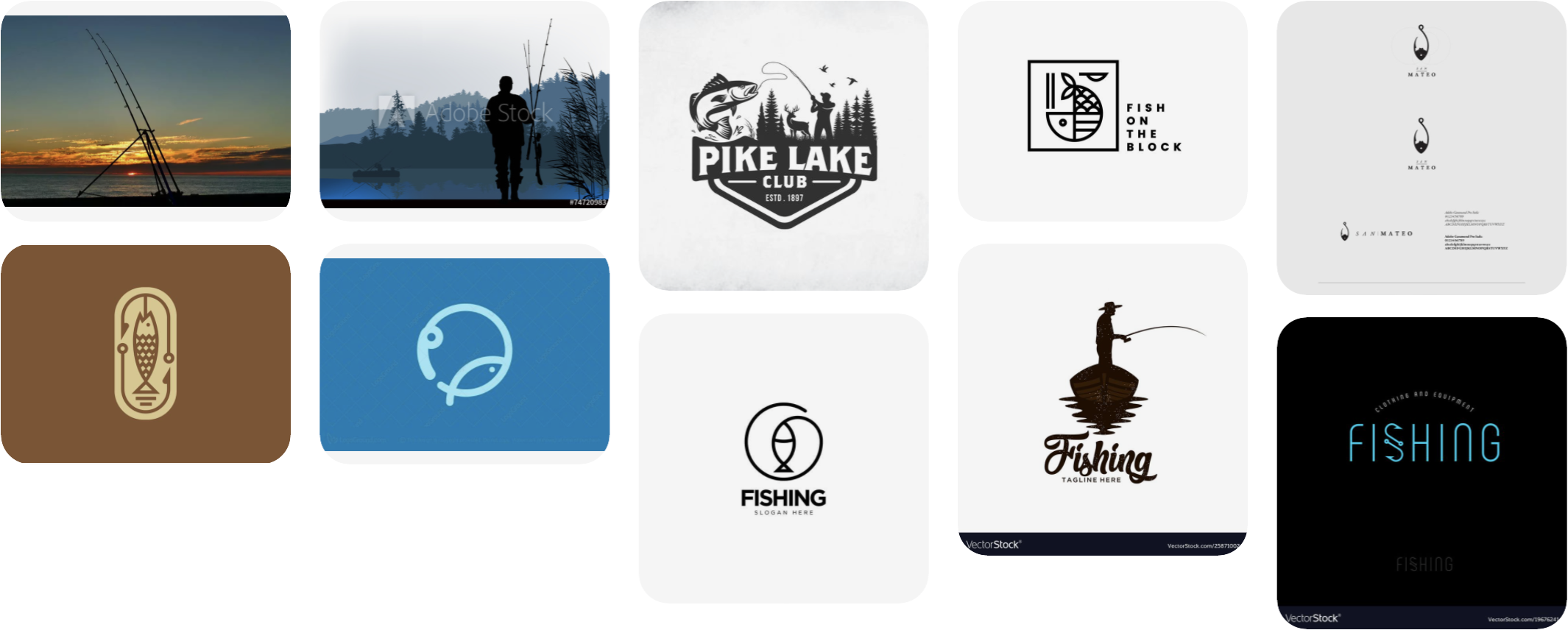
Visual references
After talking with Jon about the project, and what he had in mind or was expecting for the visual identity, I looked for referential material, and created a board in Pinterest with the visual references.
The result
The idea was to create a minimalist and simple logo, having in mind that it needed to work well at small sizes. The Club’s visual identity needs to transmit the calmness fishermen have while they contemplate and wait for their catches.

Main version of the logo.

Color variations of the logo.
As the logo is thought to be mainly used at the digital platform, then it would be needed to have the isotype. But as in the imagotype the isotype is square-designed, then I thought it would be more effective to have the isotype adapted to a round form, working better both for an app icon and for the website favicon.

Color variations of the isotype.
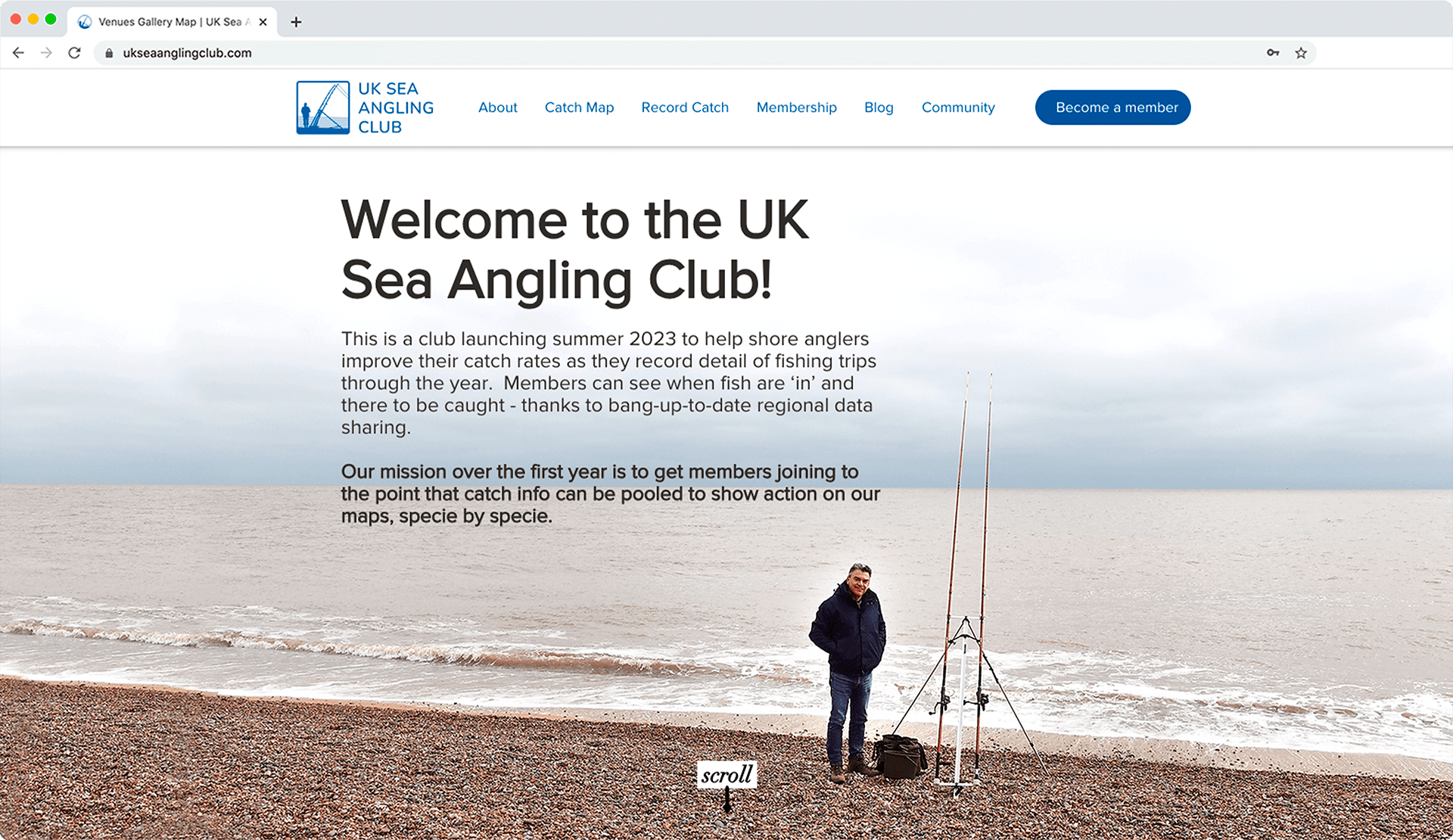
The logo and isotype applied in the UK Sea Angling Club's website.


